

Designing a Network’s Rosetta Stone at Nyansa
A peak into the process of designing IT software that tells a story.
Background
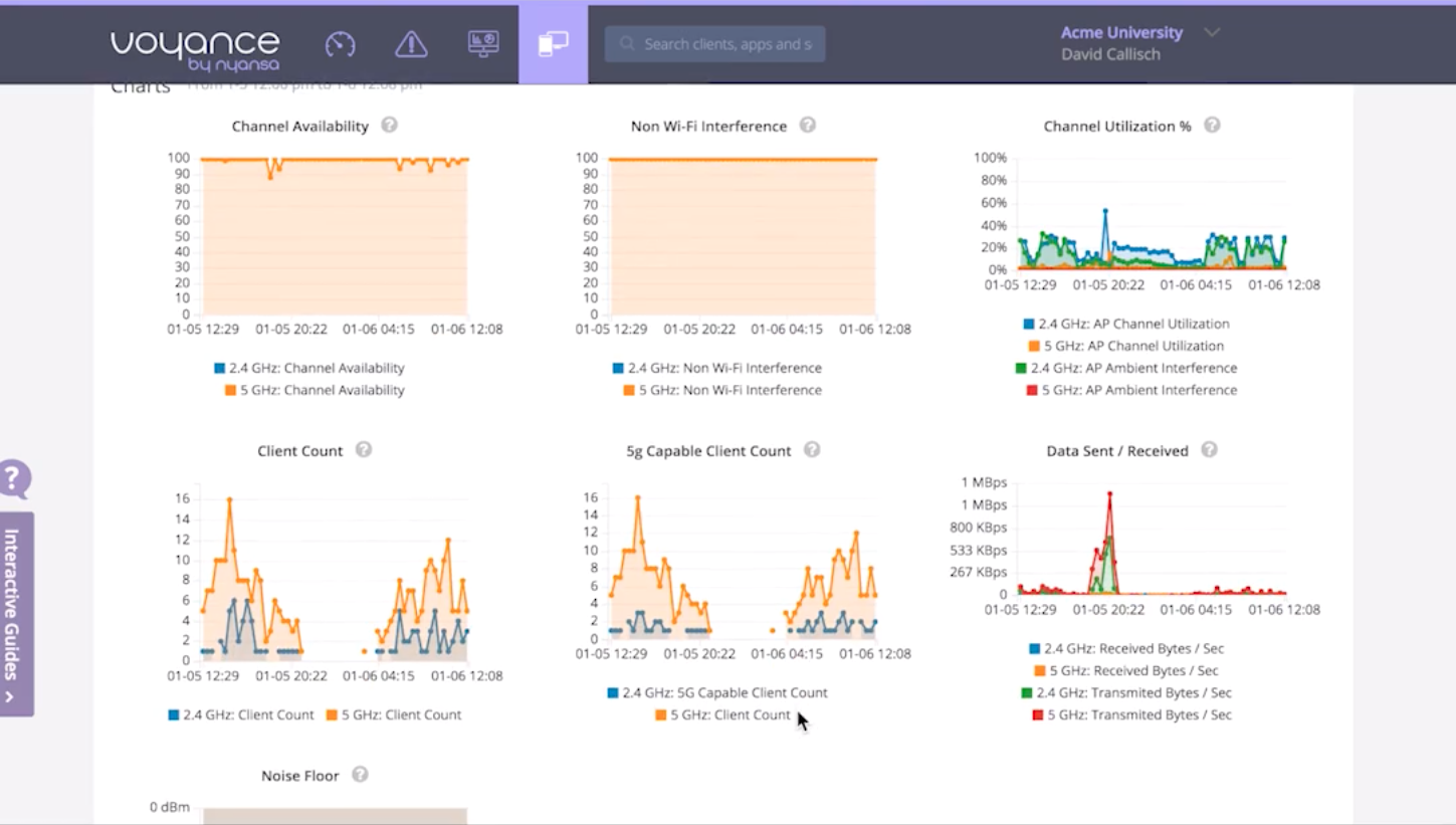
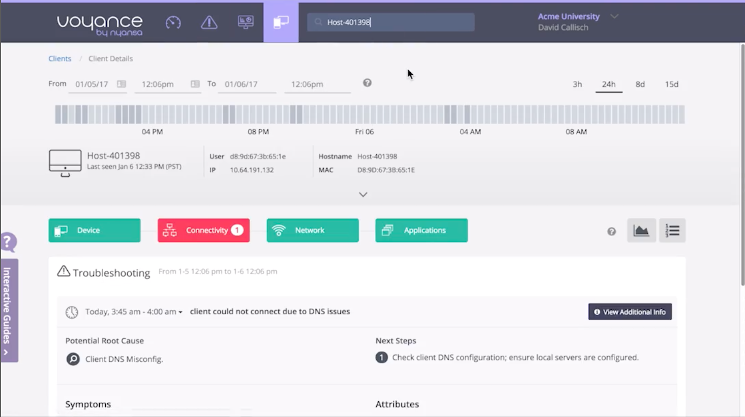
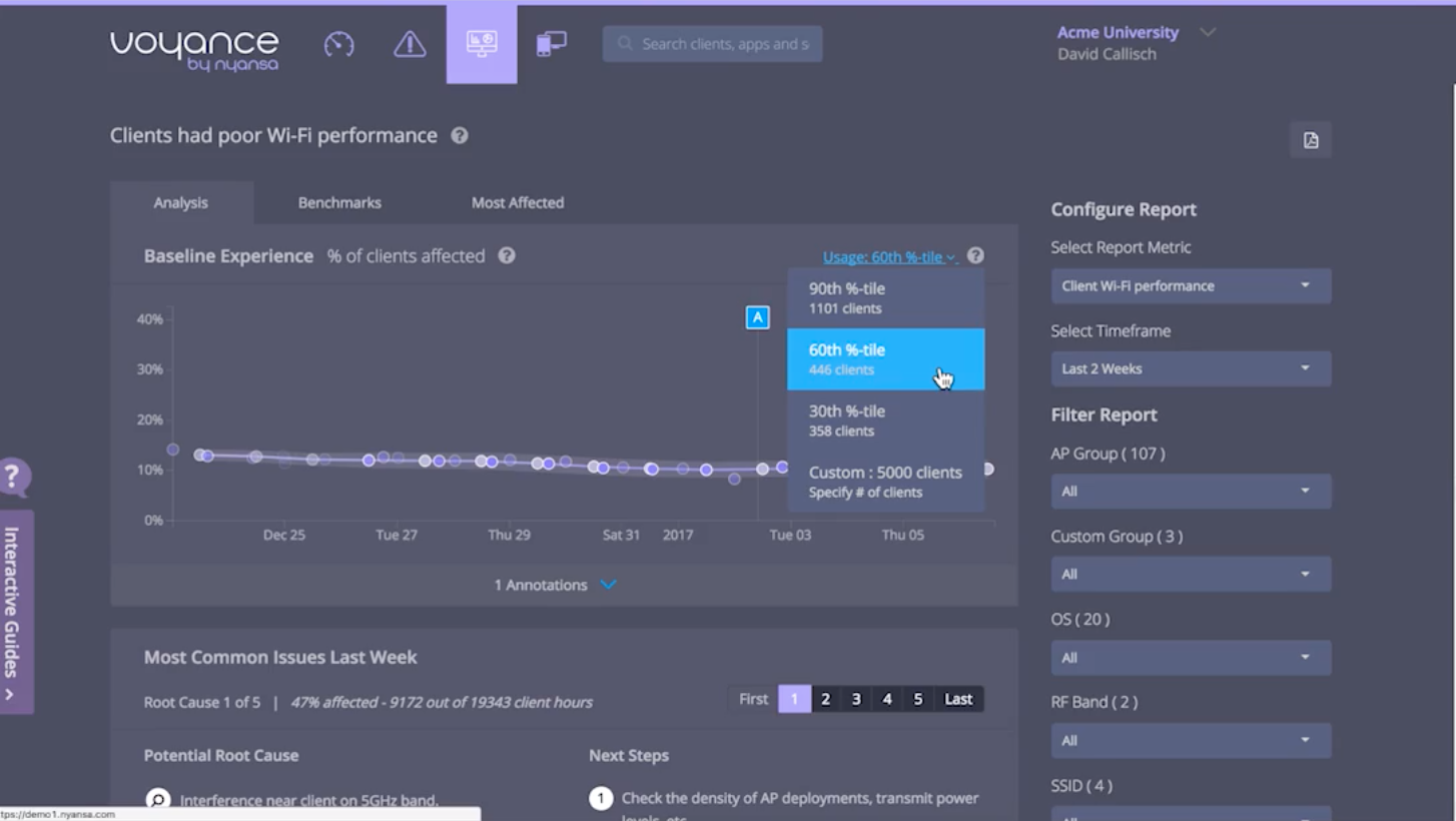
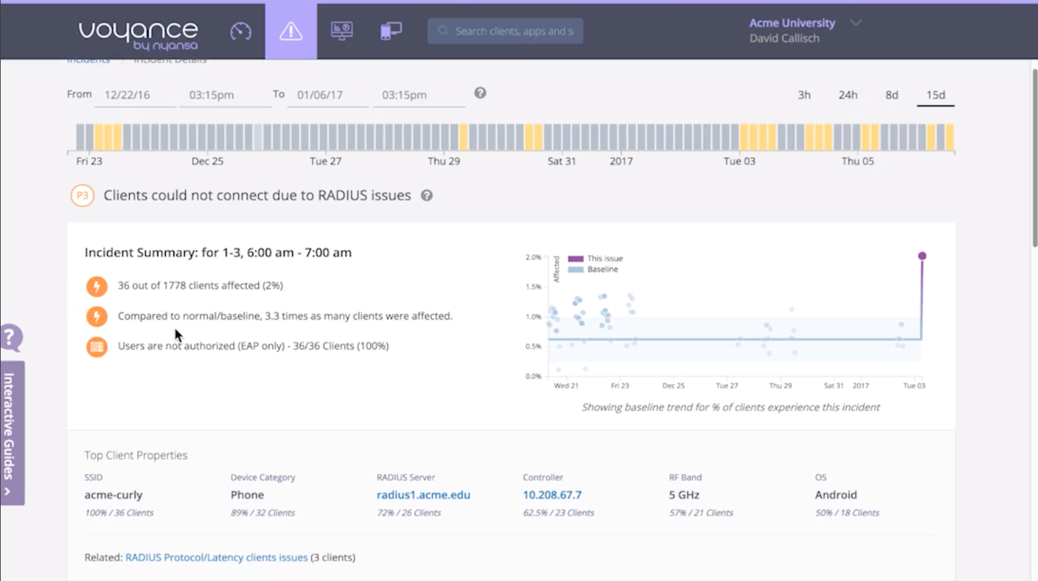
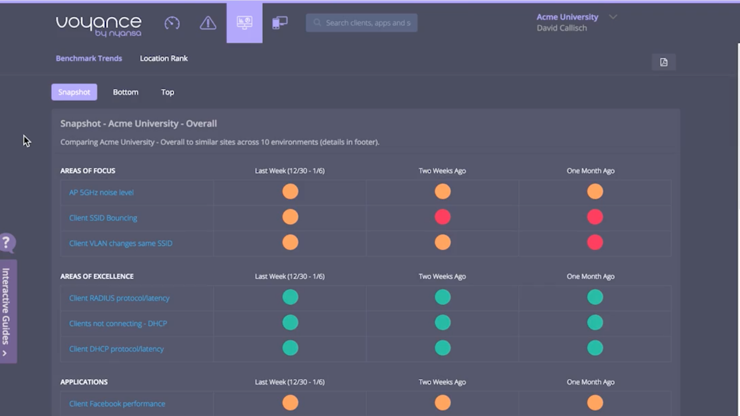
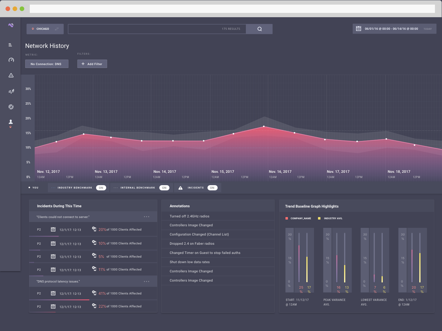
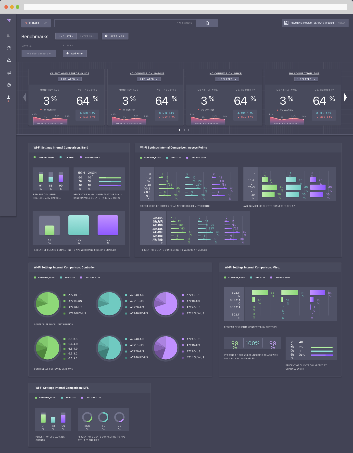
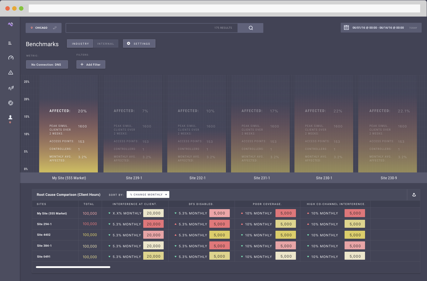
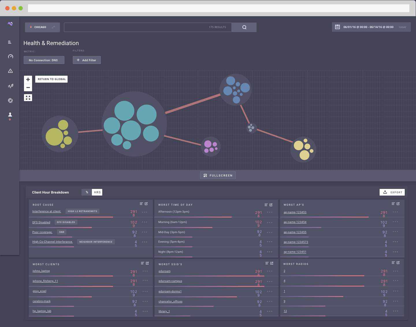
Voyance (the software platform built by Nyansa) analyzes every client and device transaction across a network, correlates data from disparate sources to pinpoint problems, detects behavior anomalies, surfaces root causes, and recommends next steps.
I joined as the Principal Designer, tasked with owning the user experience as a whole. Our legacy product was not even a year old but wasn’t scaling with the growing product suite. Workflows were disconnected, insights were difficult to understand, and the product lacked pathways from insights to resolutions. We were a small team, with a small budget and a small customer base. The only big thing was the task at hand and it made a strong case for intimate cross-functional collaboration with product management, engineering, sales, and customer success.
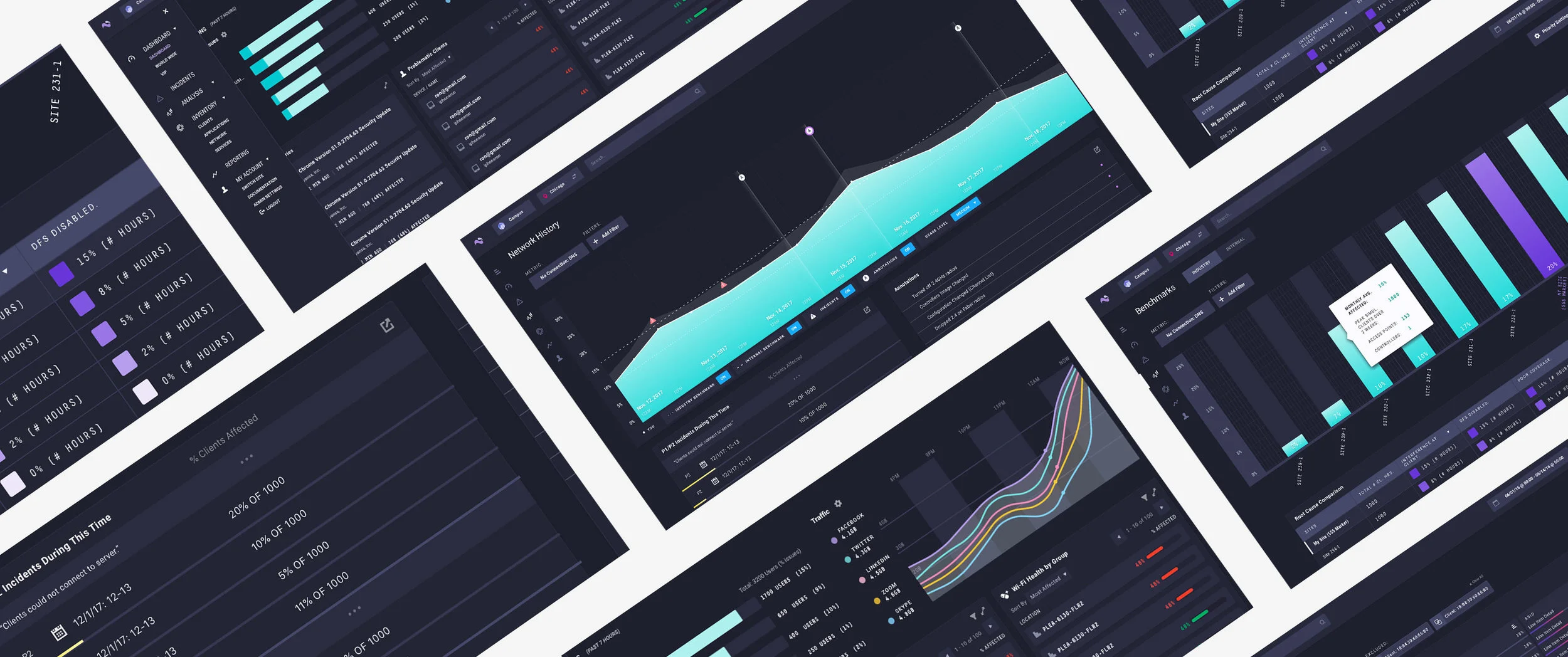
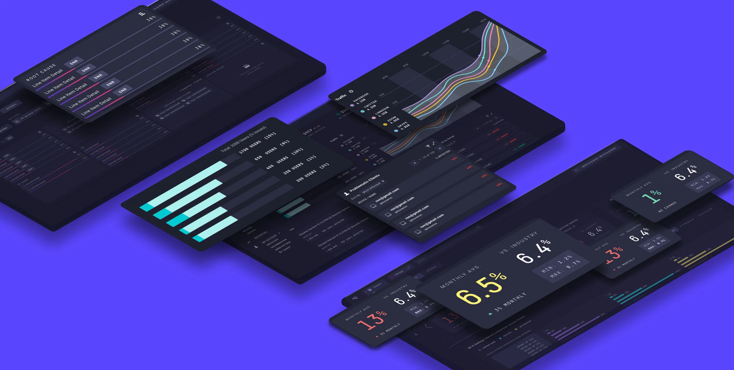
Below was the state of the product upon joining.
Process

Research was my first step in understanding the problem and finding a solution. After a fairly exhaustive procession of user and stakeholder interviews, competitive research, and “classes” in networking and IT (instructed by none other than our founding team), I had put together a strong case for redesigning our core product.
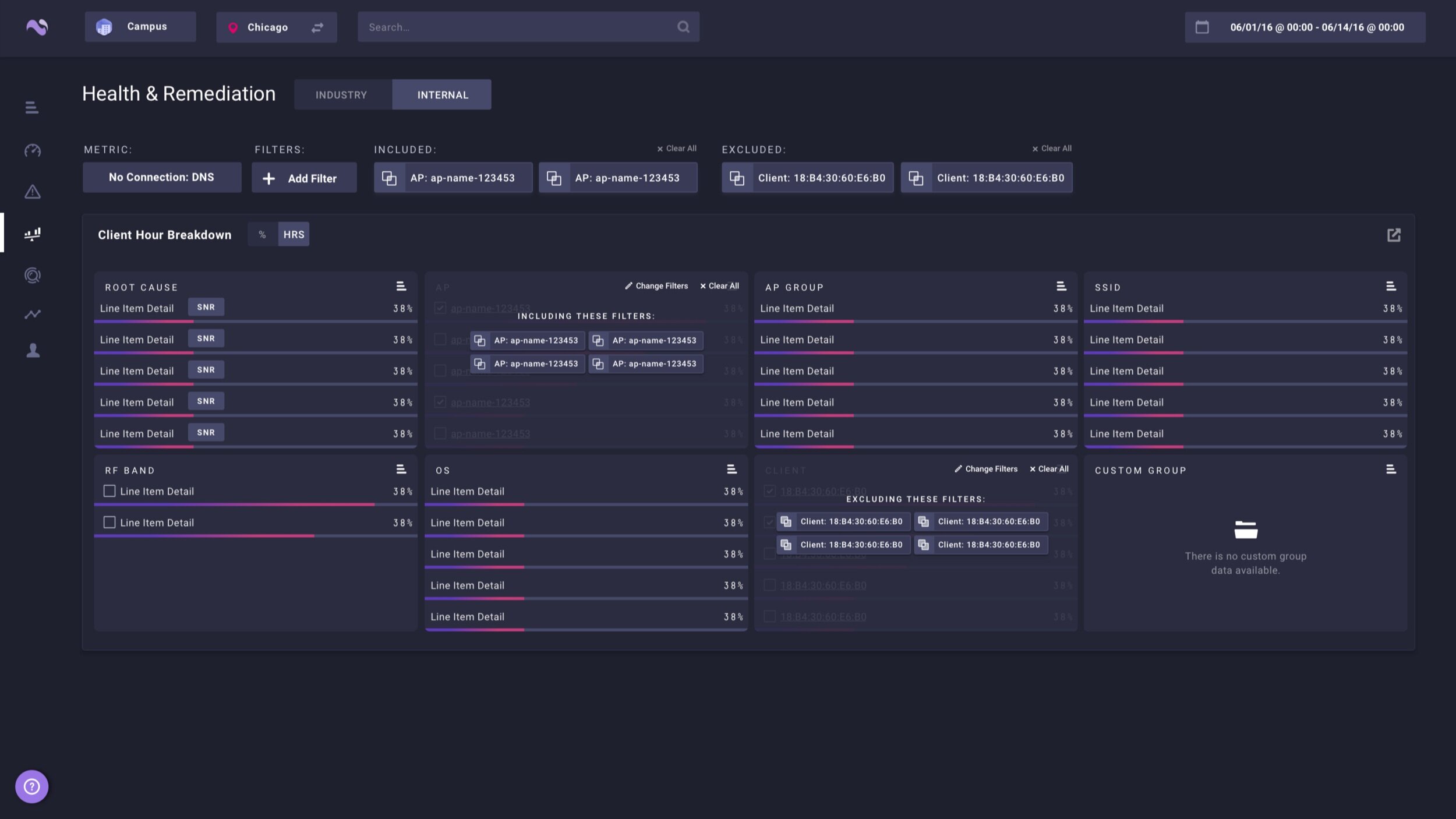
The problem at its core: The analysis section (the section of the app that held the most market differentiation) was hard to navigate and understand. People were overlooking some of the most interesting pieces of data and not getting value out of the very thing that set Nyansa apart—360 degree knowledge of how your network is performing, where it is failing, and how you can get it to improve.
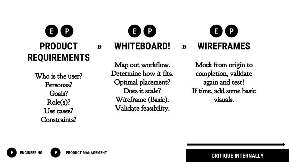
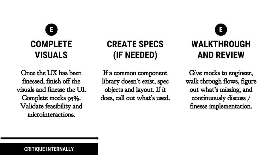
Designing the Solution
After researching the problem, building key personas, and restructuring the workflow, I kicked off the design phase using blueprints. I found keeping color out of the conversation gave more room to focus on pure workflow and data discovery.
A few rounds of validation later, I added a few more colors to the blindingly blue palette.
Feedback
The feedback was mixed but here were just a few of the things we heard:
“I’m not sure what the insights charts are supposed to be telling me…”
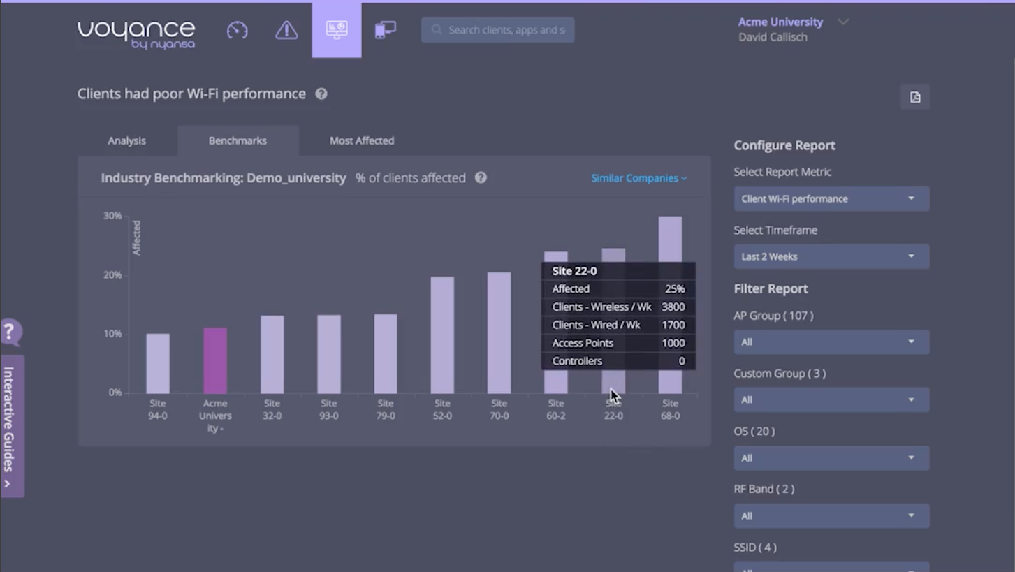
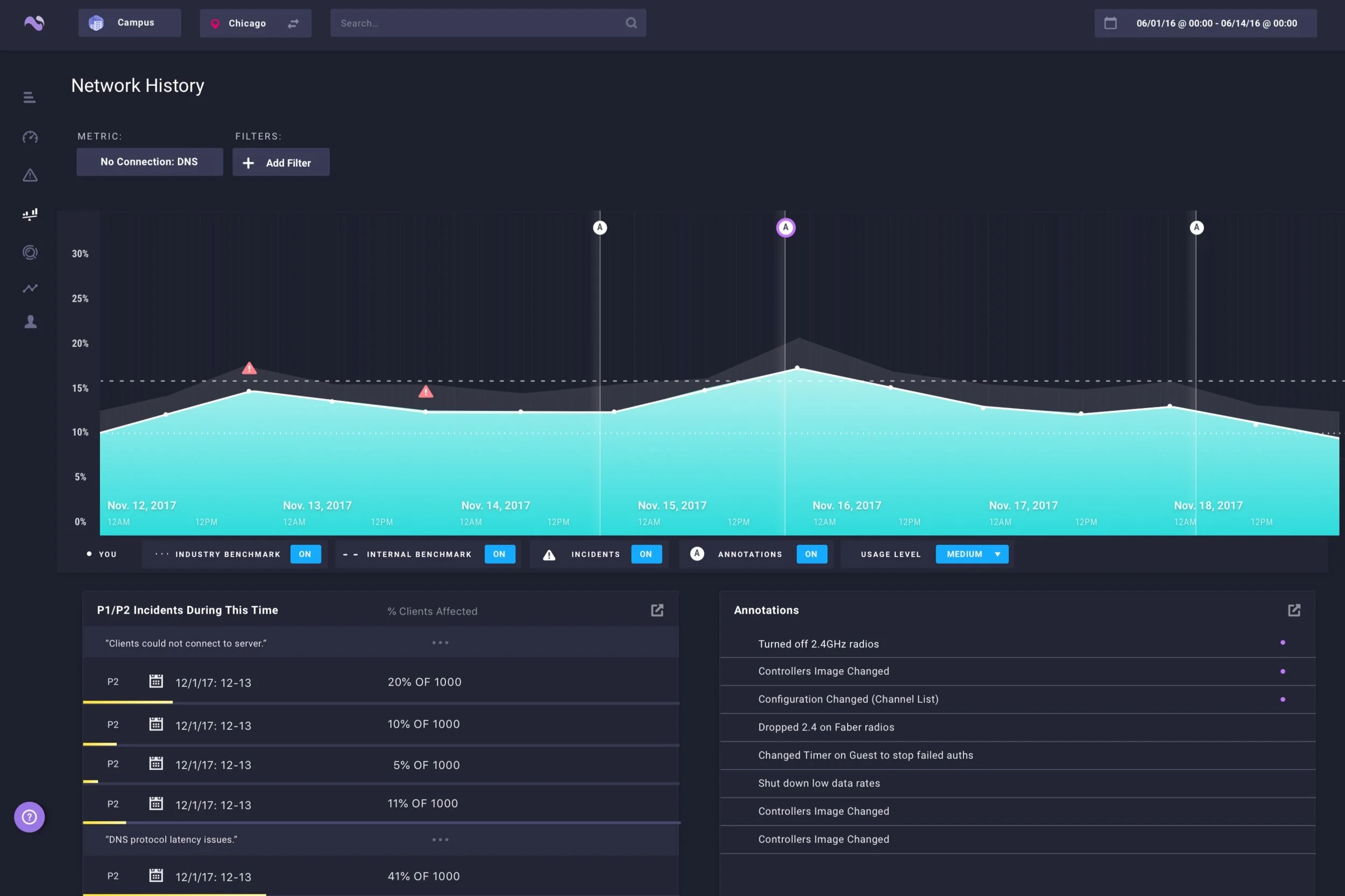
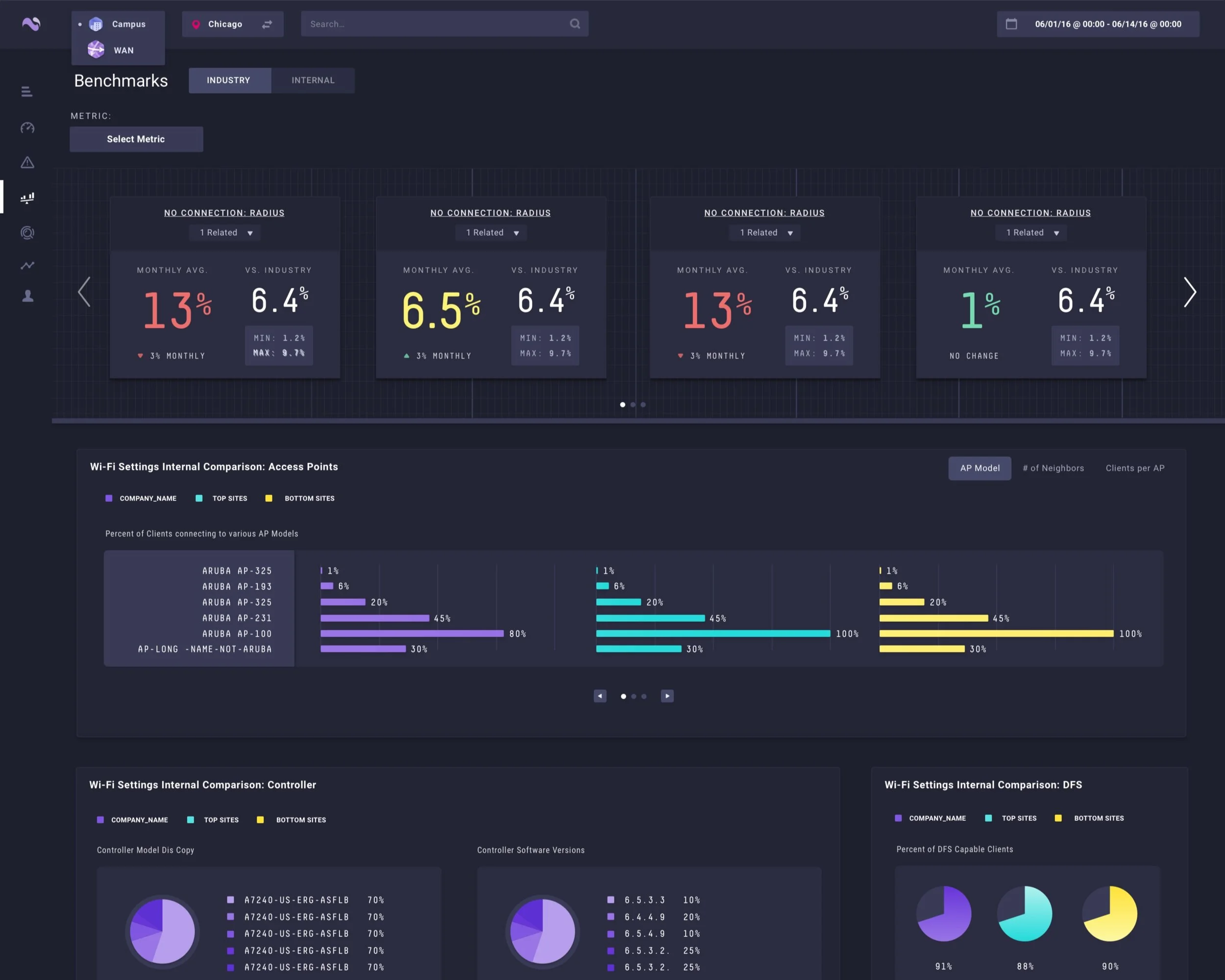
“What are the sparklines in benchmarks denoting?”
“Seriously…why the 🤬 is my network on fire?!”
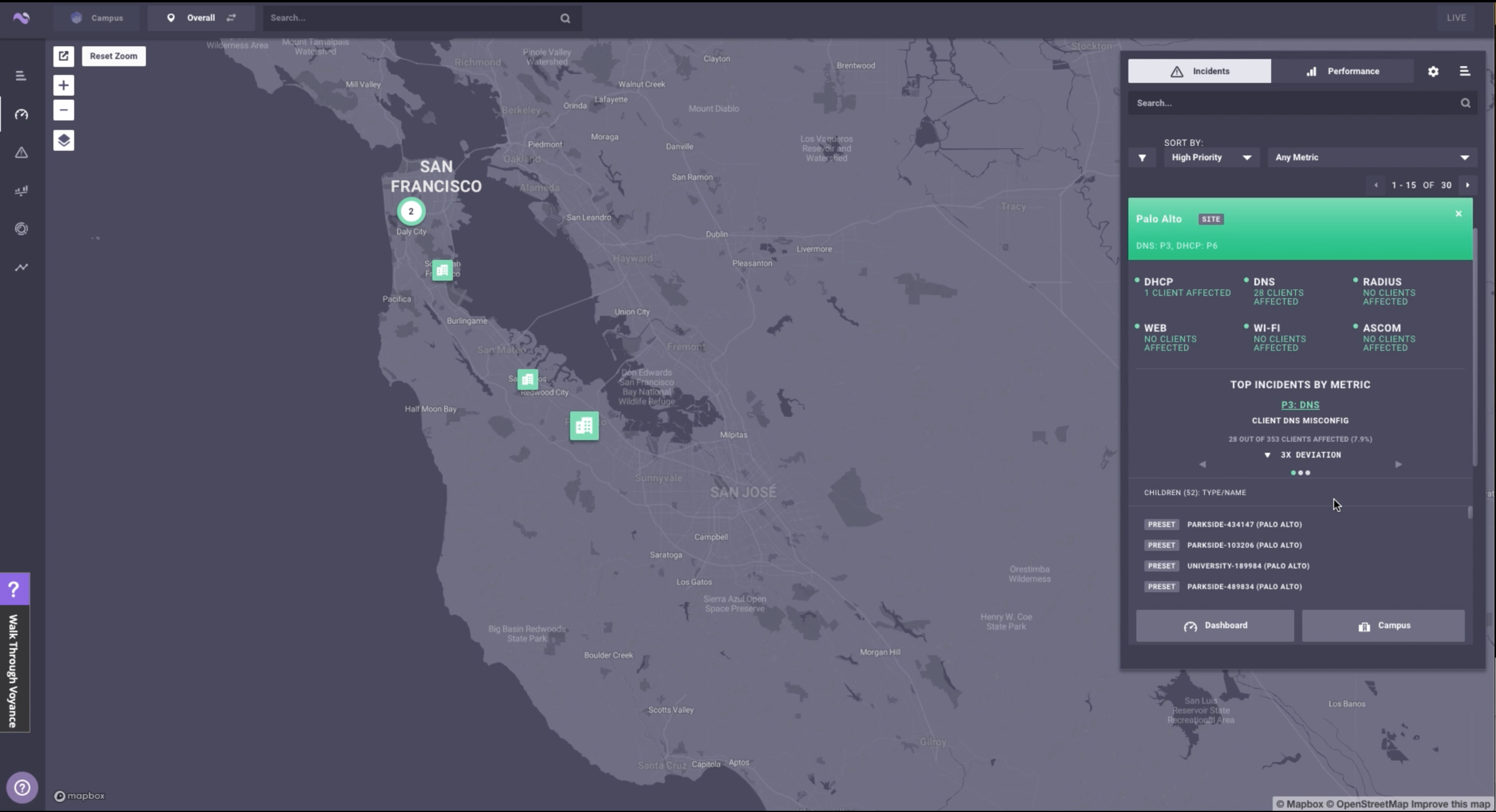
“Why is my network on fire?”
“What are all of those floating orbs?”
“Good lord…my network is on fire...”
“I can only organize by incident?”
I noticed a trend.
Colors brought their own challenges—namely that I had to start avoiding all reds, pinks, oranges, and yellows. Anything that could be classified as a negative color, would be classified as a negative color. Red, orange, yellow—these were early and late warning signals that would tell people action was urgently needed.
After more rounds of iteration, more feedback, and much refinement, I was able to get our colors in order. Additionally, a great side effect of redesigning our look and feel was that it also created a path for a unified style across the entire application suite. This helped us set the stage for a larger design system effort to come and eventually opened the door for light and dark mode. Beyond that, I spent the remainder of my time strategizing how to better represent the right data, improve the workflow, and work with product to plan for the next few rounds of improvements after the beta had released.
Results
Not only was our UI now slick and updated, but we started to reap the reward
of our efforts pretty quickly.
Upgrade in Efficiency:
Since we were updating our look, we also had the opportunity to update our code base. In what we considered phase 1 of our design system, we worked with engineering to rebuild our UI framework and thus create a library of components and common styles to be used across the application. This resulted in an 83% improvement in efficiency when building new UI!!!
Impactful:
When I started, we were still small and with only a few key beta customers. Once Voyance (the software) began to blossom and gain significant market traction, our customer base grew quickly. Opening up our analysis section and representing our true market differentiators made way for us to acquire our first 100+ customers in education, healthcare, and enterprise.
Additionally, we also grew enough to warrant our next round of funding. Thanks to our growth and traction, we managed to raise our Series B from Intel Capital.
Roadmap Influence:
Lastly, as a result of the increase in traffic observed in the new analysis section, usage began to drive demand for other features such as network friending. Our users were so excited at the opportunity to measure themselves against a wide list of other networks like theirs, that they began to ask for introductions so they could knowledge share and improve their efficiency as a community. It was unexpected, but truly phenomenal.
Mentions
“[Nyansa’s technology yields]... insights, patterns and trends that can be used to quickly understand the impact of any infrastructure anomalies affecting end-user performance on the network.”
“Voyance effectively automates all the analysis and correlation of this data up and down the stack to give us meaningful insights into our users’ network experience that conventional infrastructure management technology has been unable to deliver in a holistic fashion.”